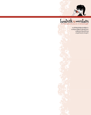
Here is some work for one of my clients, Anna. They had their logo which consisted of the girl (needs to be above some solid shape), mountains, and the "Beatnik Mountain: For the adventurous in mind and spirit." Anna said that they wanted letterhead, new business cards, a bumper sticker, and thank you cards.
I worked on the letterhead and business cards one day and will work on the other items once these are decided on. These are not the finals; I am still waiting on feedback.
Here is the original business card. They were all the same. The ladies at Beatnik Mountain wanted some variety. I used the colors that already go with their various products to keep the look together.
Here are the new cards. I simplified the mountains. I also changed the typefaces to match the one in the logo instead of having four. There are three versions and three colors. I am not sure if this client will decide to do all the same color and design or choose to go with three colors and three designs. I like the three colors and three designs. The three colors could match the letterhead style that we end up going with.


No comments:
Post a Comment