Here is the beginning of the online store for the WOW gift shop and gallery. It has quite a bit farther to go. I am gathering information for this project and will be photographing more images soon.
This blog is dedicated to my internship at the Wyoming Women's Business Center as their graphic designer. There is a large variety of work showcased here. If you would like to check out my current blog featuring my personal artwork, it can be found at FeliciaFollum.blogspot.com.
Wednesday, December 1, 2010
Logo Design
 |
| Old Logo |
I started off trying to represent a female form and mountains in the top two.
 |
| Here are some possible business card layouts. |
Mid - Intership Reflection
What have you learned from this internship?
I have learned a lot about business. I have learned more about working with clients as well. My internship has encouraged me to enter work in the gallery. This has been a good experience to learn about pricing and selling work. I have sold more work in the current show than ever before.
I have also learned a bunch about InDesign and actually had a chance to use the program. I am also learning iMovie (and iPhoto).
I am currently working on an annual report. Annual reports are something that I was not familiar with in the past.
What do you still want to learn?
I would really like to lead a workshop. I am thinking either something to do with art journaling or paper bead making. In the past I have given art/graphic design lessons to people and would like to continue developing skills to better give lessons.
What is your favorite aspect of your internship?
My favorite aspect is that I get to do a combination of art and design. I love designing logos and working with business people but I do not want to give up my artsy, less corporate side as well.
What is your least favorite aspect of your internship?
Joomla. The program seems like it has great potential; however, it is extremely frustrating. I think that we are not using the full potential. I don’t really understand the program that well and it is not intuitive.
Tuesday, November 30, 2010
AAH Affordable Art for the Holidays Video
Here is my slide show from the opening...
There are still a couple changes that I want to make. For example I am not sure why the last little bit, which includes the WOW logo, is cut off
There are still a couple changes that I want to make. For example I am not sure why the last little bit, which includes the WOW logo, is cut off
Thursday, November 25, 2010
Files and business cards
I have also been learning the importance of importing photographs and how much of a pain it is when files are not properly inserted into documents. Most every project that was passed on needed to logos replaced. This made simple projects like already designed business cards a somewhat difficult task. The files were all transported via cds and the logos were separate from the other files.
I have also learned that Apple D is my favorite quick command in InDesign. Not remembering this caused many problems early on.
I have also learned that Apple D is my favorite quick command in InDesign. Not remembering this caused many problems early on.
Wednesday, November 24, 2010
Saturday, November 20, 2010
These are almost final. I think we will be getting rid of the facebook page on the business card.
There is also a more plain version of the the letter head. It looks like the one above but the mountains are on top.
 |
| Business Card 1 |
 |
| Business Card 2 |
 |
| Business Card 3 |
The letterhead matches the business cards
 |
| Letterhead 1 |
A fun little extra.
 |
| Christmas Letterhead |
There is also a more plain version of the the letter head. It looks like the one above but the mountains are on top.
 |
| Shipping Card |
Wednesday, November 17, 2010
Annual Report
This is the first time I have every really taken the time to learn about an annual report.
Here are some screen shots of the draft.
I think that I like the design that I used for the banner better. It seems more feminine and still professional. This cover is just a placeholder for now.
I am still tracking down information and better photographs.
Monday, November 15, 2010
Banner
This is the first draft of a large banner. It measures 30" x 66." It has the mission statement and contact information.
The ladies at WWBC wanted something that they can take with them to conferences and other events. This banner will be hung on a metal stand. I am also looking at stands for WWBC to purchase.
The ladies at WWBC wanted something that they can take with them to conferences and other events. This banner will be hung on a metal stand. I am also looking at stands for WWBC to purchase.
Wednesday, November 10, 2010
Final Backdrop and In-Progress Fliers
 Here is the final backdrop for Georgia and her booth at trade shows. It is around 6' x 7.' When it is printed large the logo will go in the upper right a and a screen for video will be placed in the area below "Techniques and Technologies."
With this project, I learned how to convert outlines to shapes. This is extremely beneficial when it comes to taking a logo that is 2"x2" and making it several feet x several feet.
Some examples of fliers that will be handed out at the show.
 |
| Front 1 - Techies |
 |
| Back 1 & 2 - About Z4. |
 |
| Front 2 |
Monday, November 8, 2010
Donation Poster
WOW donated some money to the LAP (Laramie Arts Program) and they needed a quick sign to show out support. The donation will be going toward snacks and refreshments. I decided to depict an abstract wine glass. Wine is often associated with being classy and I wanted to show that out money is helping to pay for the free wine.
Here are the designs...
If we go with the second one, I think that we will be die cutting the white edge off.
Here are the designs...
If we go with the second one, I think that we will be die cutting the white edge off.
Friday, November 5, 2010
Tuesday, November 2, 2010
Tattoo Movie
Here is the Tattoo Slide Show of the work from the show. Hanna started the show, I added the photographs that she didn't have access too.
Thursday, October 28, 2010
Newpaper advertisements
Wednesday, October 27, 2010
AAH Affordable Art for the Holidays
Here are the three fliers for the next WOW show. The top two are small fliers and the one on the bottom will be a large poster.
Wednesday, October 20, 2010
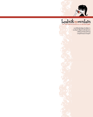
Here is some work for one of my clients, Anna. They had their logo which consisted of the girl (needs to be above some solid shape), mountains, and the "Beatnik Mountain: For the adventurous in mind and spirit." Anna said that they wanted letterhead, new business cards, a bumper sticker, and thank you cards.
I worked on the letterhead and business cards one day and will work on the other items once these are decided on. These are not the finals; I am still waiting on feedback.
Here is the original business card. They were all the same. The ladies at Beatnik Mountain wanted some variety. I used the colors that already go with their various products to keep the look together.
Here are the new cards. I simplified the mountains. I also changed the typefaces to match the one in the logo instead of having four. There are three versions and three colors. I am not sure if this client will decide to do all the same color and design or choose to go with three colors and three designs. I like the three colors and three designs. The three colors could match the letterhead style that we end up going with.
Subscribe to:
Comments (Atom)


